2. HopSkipDrive

Chief Creative Officer
Period: 2018 - 2020
Tags: Branding, UX Architecture, Transportation, B2B, Enterprise Platform Design
Rebranding* in collaboration with Use All Five
At HopSkipDrive—a mother-founded, tech-enabled transportation solution for families, schools, foster-care homes, and the elderly—I led the company’s creative transformation, redefining its brand and expanding its product ecosystem.
Initially brought on as Principal UX Consultant to refresh the mobile apps, I quickly identified a greater oppurtunity, and collaborated with leadership to chart a broader, strategic course: launching a company-wide creative overhaul grounded in four core initiatives—
(1) a full rebrand, (2) new visual identity, (3) redesigned website, and (4) the creation of the first enterprise-grade transportation platform for schools and large organizations.
In March 2019, all four pillars were successfully launched, uniting product, brand, and mission under one cohesive vision.
Strategic Highlights & Wins:
- (1) Full Rebrand: Directed HopSkipDrive’s complete brand refresh, repositioning the company as a trusted, safety-first leader in youth transportation.
- (2) Visual Identity: Rolled out a new, scalable visual system and brand style guide to unify product, web, and marketing touchpoints.
- (3) Website Redesign: Designed and launched a clean, modern web experience to reflect the company’s evolved identity and improve usability.
- (4) Enterprise Platform: Concepted, prototyped, and delivered the first-of-its-kind platform tailored for school districts and organizations to manage and optimize student transportation.
1
Logo - Old

Logo - New

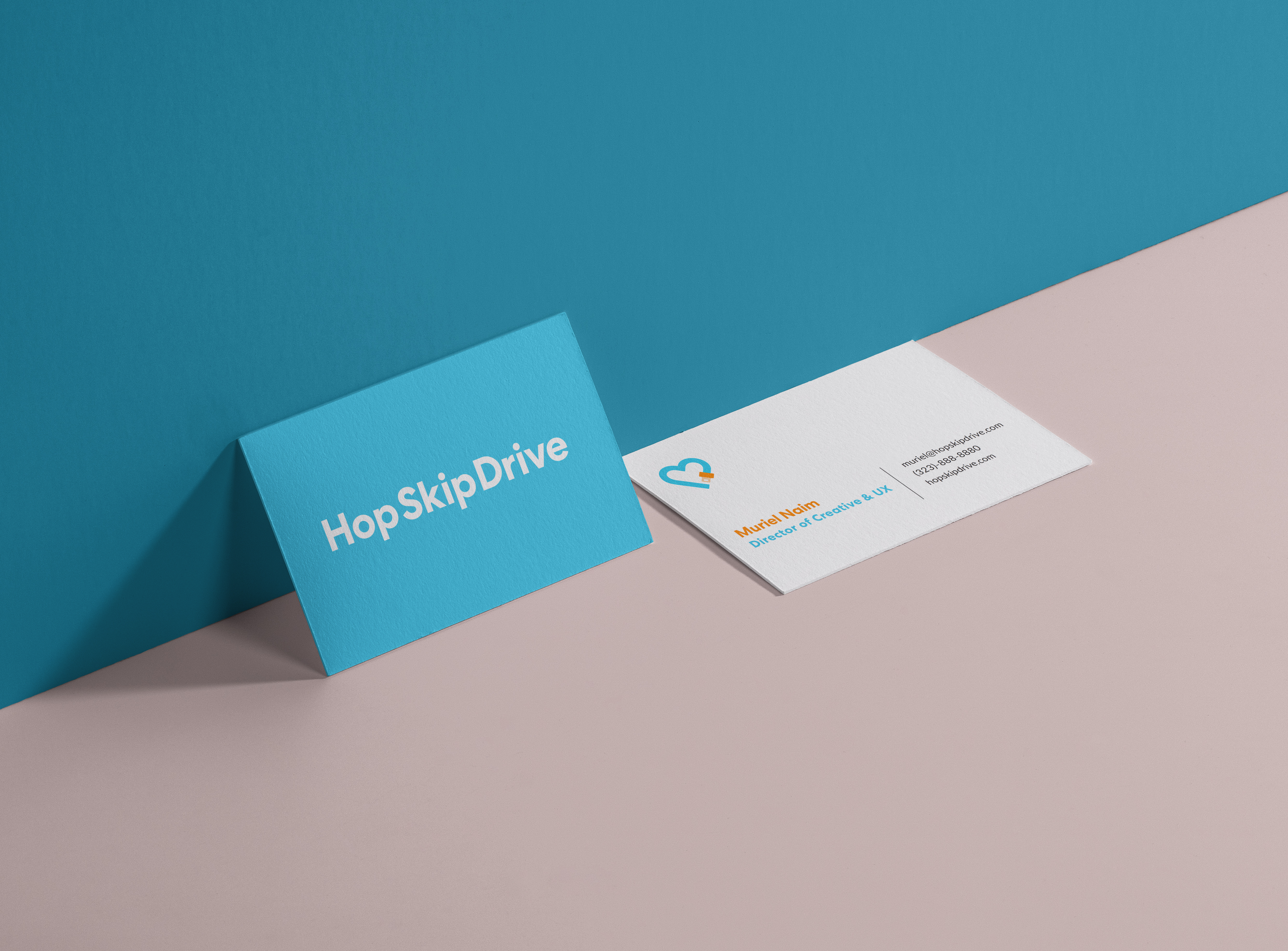
The rebranding process was thorough, followed by numerous check-points and internal discussions with HSD’s co-founders and department VPs. Our main inspiration was drawn from easy-to-identify universal, minimalistic symbols, combining flow and simplicity and underlining the warmth, care & safety - HopSkipDrive’s top values - along with its new message;
The tech-enabled, modern solution for kids’ transportation.
Along with the logo & symbols refresh, the color-palette was a crucial element to tackle; From a triple-core palette, leaning heavily on Grey, along with dimmed Cyans and Oranges, the core palette was reduced to 2 vivid lead colors, and the palette was extended in order to support the growing needs of both the Creative and Marketing departments. Adding pastel colors and mid-tones helped enhance and diversify the leading duo palette to a larger, more versatile range.
2
New Color Palette

Secondary (Marketing & Print)
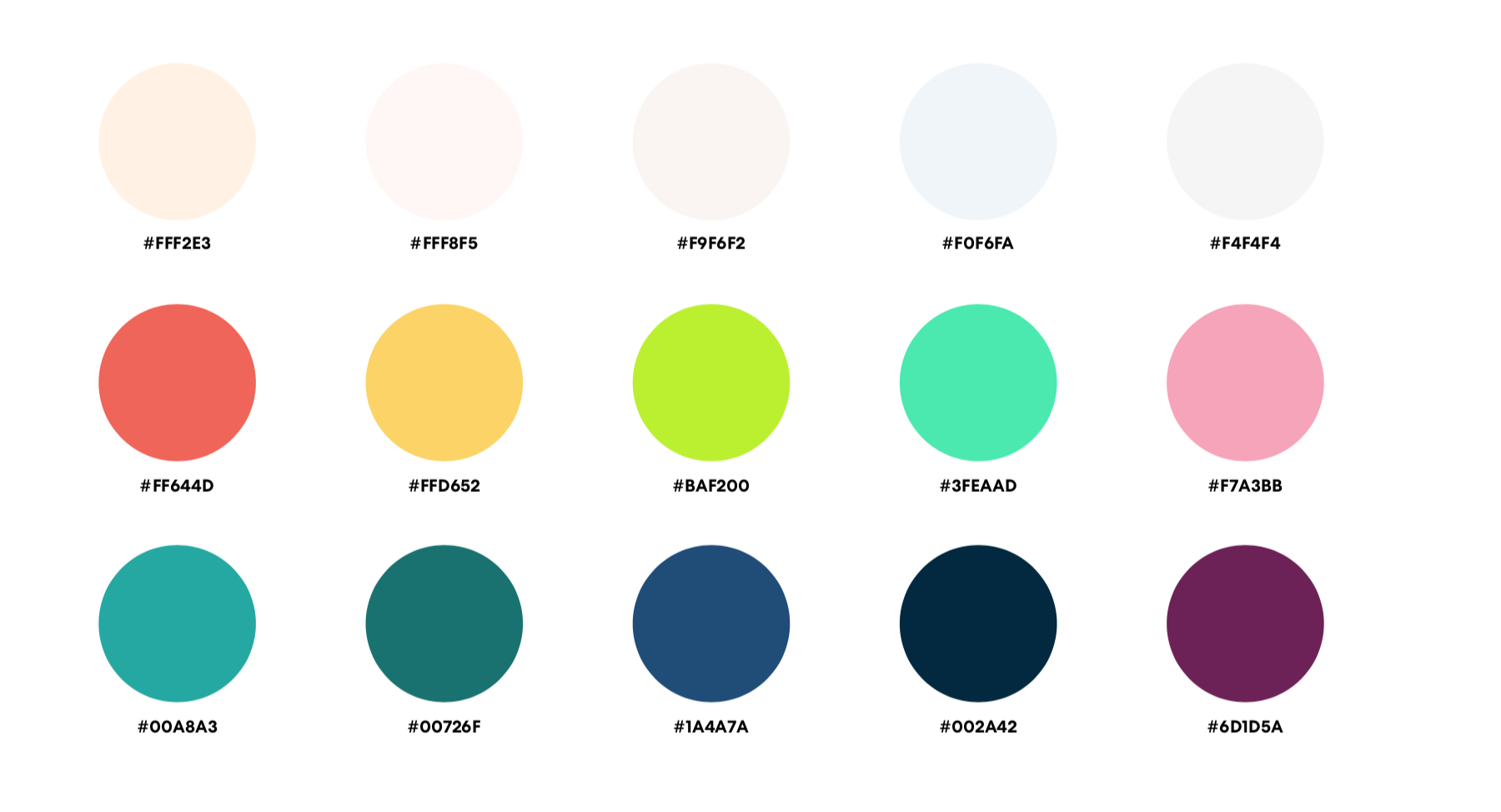
Stationary
Digital Identity

3
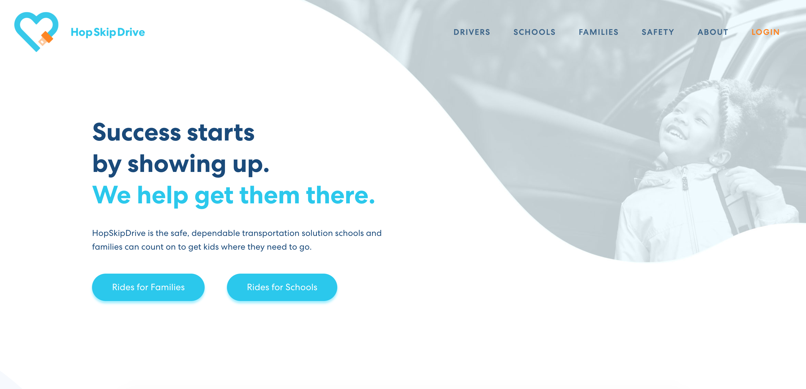
Website
Content wise, the new website had to speak to school organizers, transportation coordinators and district officers; A major shift from HopSkipDrive’s previous end-users which consisted of young couples and working moms. The shift was evident not only through branding, custom fontfaces and visuals, but also through a full copywrite rebrand and condensed messaging. As a Head of Creative, my goal was to tell HopSkipDrive’s new story, as well as to avoid clutter - both in wording & site infrastructure.
The design follows a clean line: a minimalistic yet efficient approach, core brand colors on white BG, and updated iconography - speaking directly & genuinely to the target audience.
(See old site; https://tinyurl.com/yyohdp4l | New site: https://www.hopskipdrive.com/)
Website - Old

Website - New

4
Enterprise Platform
The enterprise platform—built for school administrators, district transportation leaders, and nonprofit organizers—was designed first and foremost for scale.
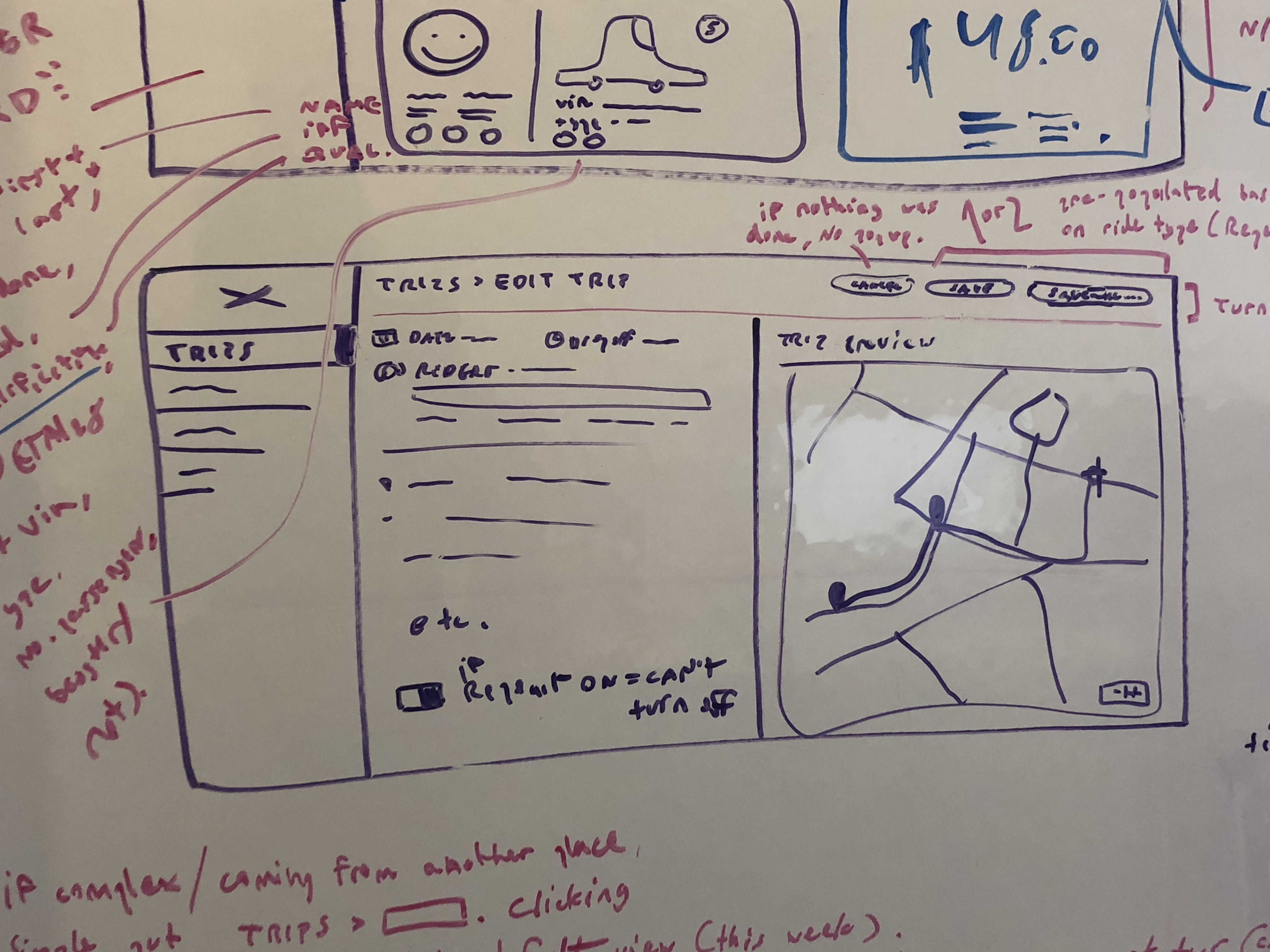
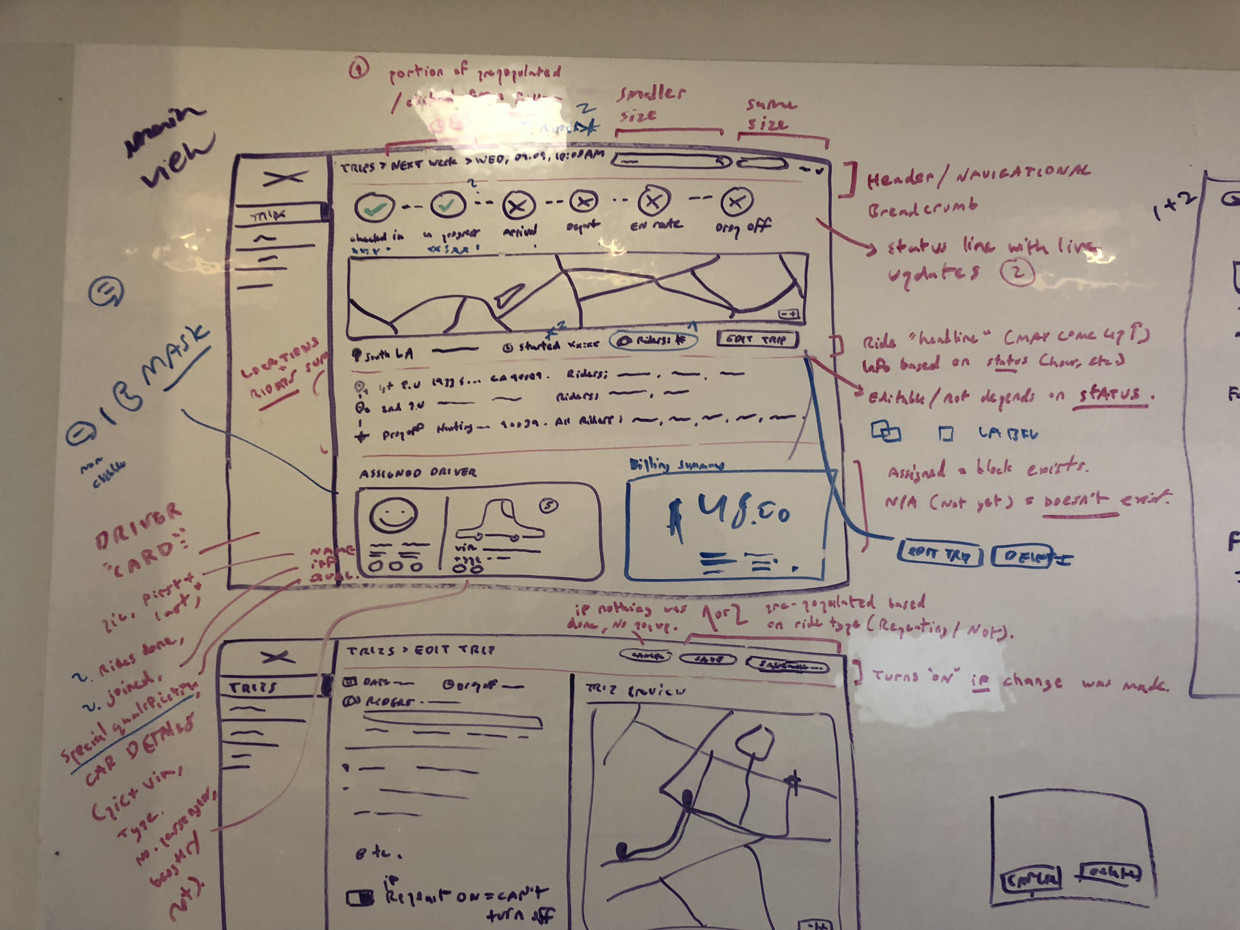
With no direct industry precedent, I rolled up my sleeves and drew on my experience as a UX Researcher for large organizations to lead a focused, three-part planning process: (1) Deep competitive SaaS research, (2) Platform analysis and Fleet services IA layout breakdown, and (3) User testing + in-depth interviews.
Partnering closely with the VP of Operations, Product Leads, and CTO, I architected a robust platform featuring real-time geolocation, an intuitive fleet-style operations dashboard, and a machine learning–powered route planner.
The result: the first-ever interactive transportation planner, and HopSkipDrive’s flagship SaaS product to date.
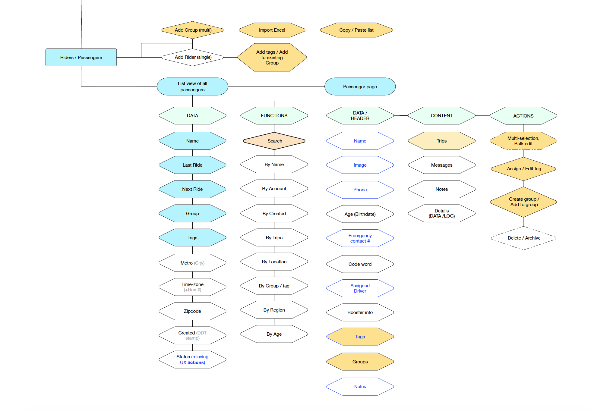
A. New Information Architecture

Detail;
B. Rough Sketches
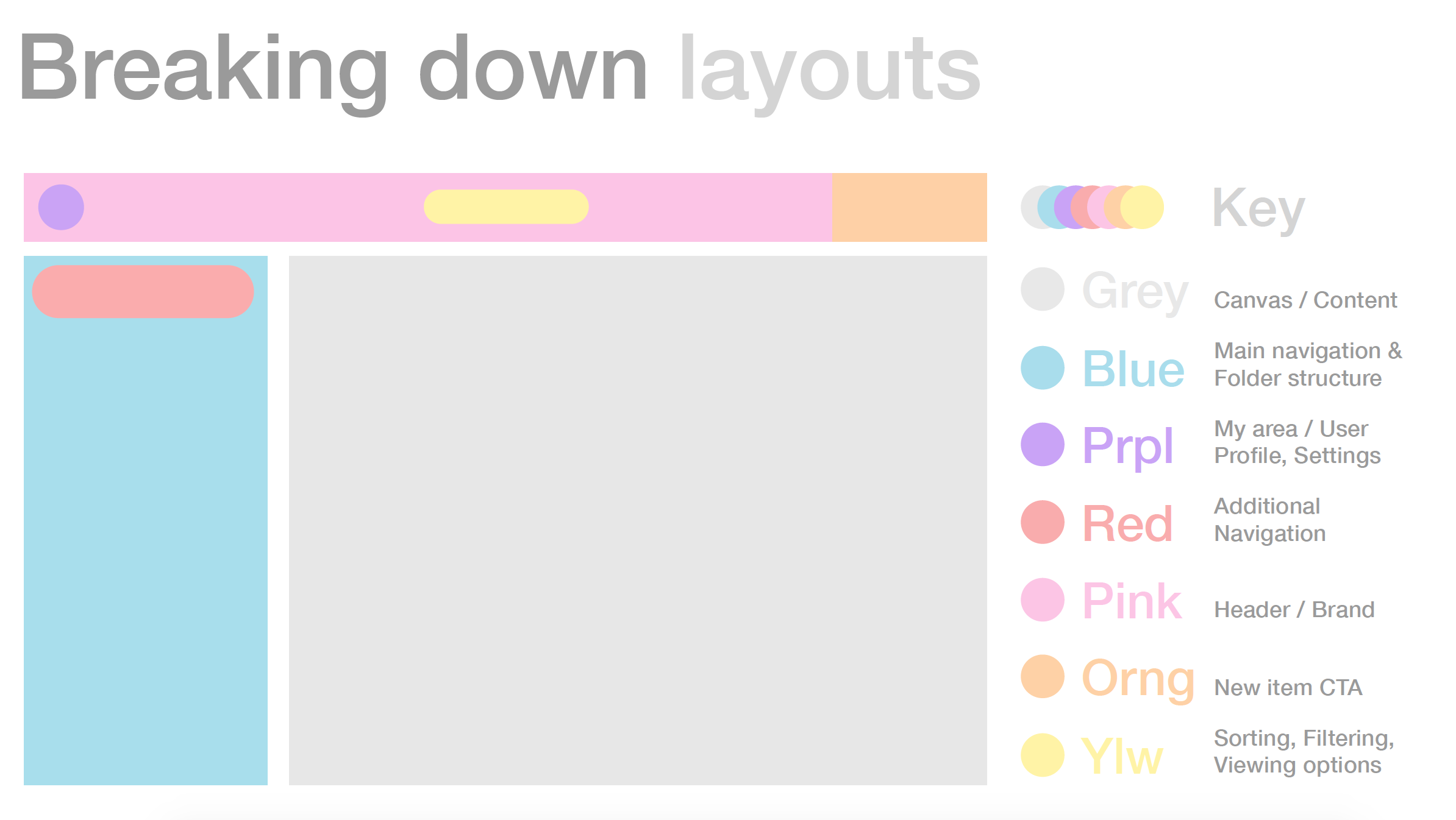
C. Layout Analysis & Breakdown
D. UX, UI & Graphic Layer


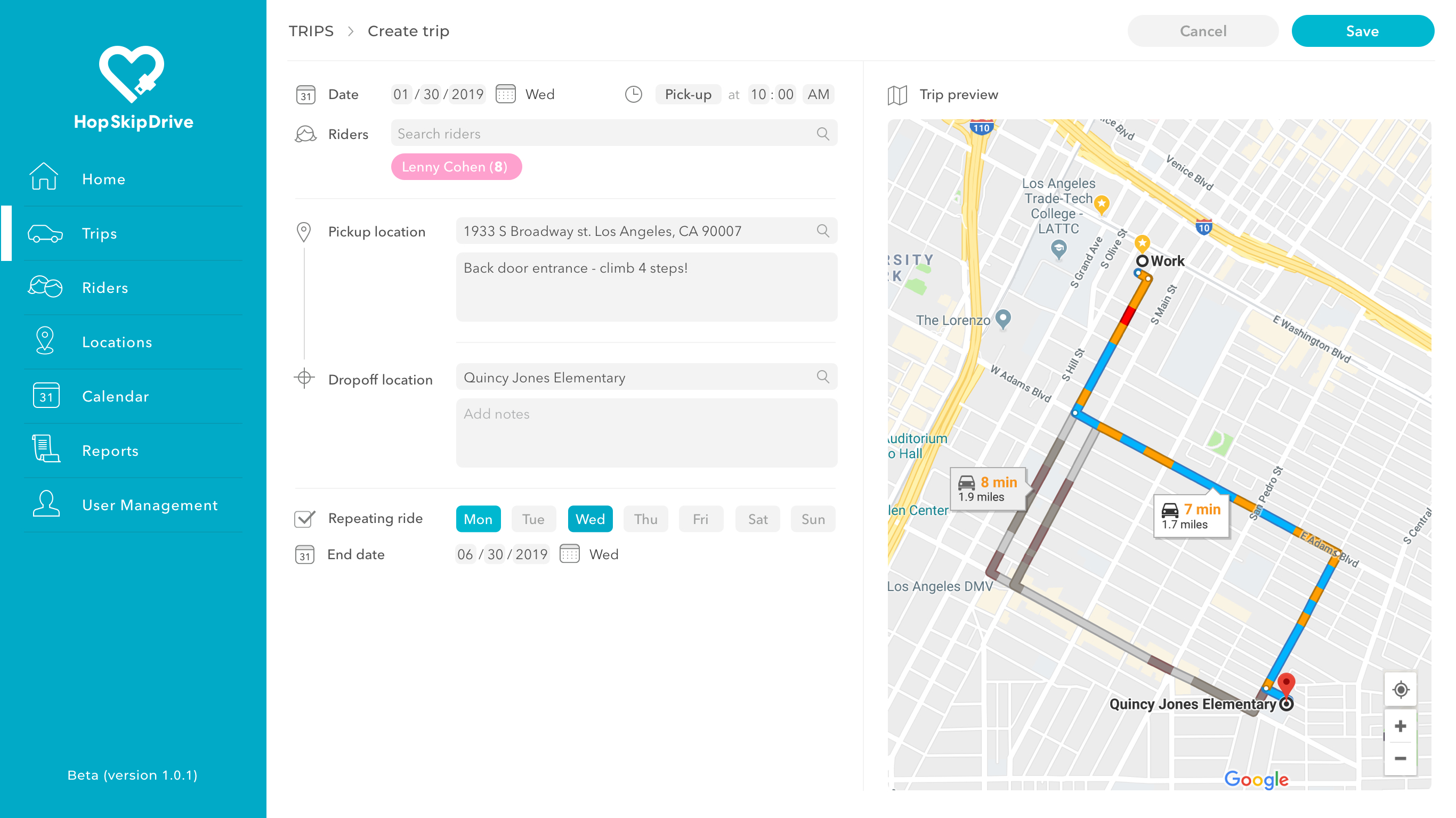
Tablet consistency / Form sample
E. GUI & Guidelines


